
Felicia
Miclea
If our environment can affect our mood , then what is the role of colour ,present in interiour spaces?
The Effects of Colour
If our environment can affect our lives in a very effective way then how does colour surrounding us affects our mood and energy?
Discovering a therapeutical way of using colour in my work has been definitely changed my mental state while working on the installation. Colour and it’s effects being one of my interest’s in this project ,I started experimenting using warm and cool colours together.
It is known for a long time that colour has a Psychological arousal effect and it is effectively used into creative designs to evoke feelings of calmness, relaxation ,joy and excitement.
Warm colours such as yellow, orange and red are perceived as fun and exciting ,while cool toned colours are used to give a feeling of calmness ,relaxation and trust. These colours have hugely impacted or perceptions in different coloured environments.
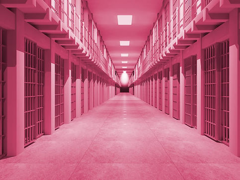
The most used and emphasised colours into my work are pink and green, while green is perceived as a colour of nature ,growth and health. Pink otherwise has been found to be a calming colour not just by interior designers, but used by phycologists to prove its effects of calmness into jail environments.
A particular shade of pink ,similar to candy pink has been reported to calm us down while reducing aggression. This shade of pink is called the Baker Miller Pink ,and it has been the most used colour in prison spaces for social experiments ,used for it’s qualities of promoting calmness on the inmates.
Psychiatrist Max Luscher found that the colours we prefer are depending on our present mood .His experiment was based on presenting coloured cards to his patients ,discovering that the ones they particularly chose, were indicating their mental state. Cool colours such as blue and green’s were indicating that the patients were feeling calm or happy, while their choice of warm colours ,such as yellow ,red or orange meant that they were feeling confident in themselves.
However Alexander Schauss in 1970 ,tried a different approach with Luscher’s experiment .Instead Schauss experiment was used by exposing patients to certain colours trying to see if the colours would stimulate and influence their mood. In this experiment he took 153 men and required them to get a strength test before the start of his experiment and exposed them to pink and blue cards for one minute each .After looking at the pink cards the volunteers had a loss of strength of 26%compared to after they stared at the blue cards. The results of the experiment were in fact true as Schauss hoped,the one particular shade of pink was having an effect of lowering the heart rate.
While some people disagree on this discovery based on the power of colours on our minds many brand companies have prove it to be a successful discovery ,using colour persuasion ,into marketing their products having effective results with their sales .These companies such as Facebook ,and twitter have used the phycological effects of colour for their own benefit’s making the clients and users trust the application. The colour blue on the apps icons is associated by the human mind as a reliable and trusted online platform for socialising. While Instagram has been using for a long time a pink purple colour combination into their app icon making the app users associate the colour with joy excitement and exploration.
Overall, we are using colours that are taken from nature to our own advantages ,since all humans are visual beings we are stimulated by colour. Technological devices such as smart phones , and their apps ,cars ,Tv’s are all part of the techno era using the easiest but most efficient ways of persuading the human mind into buying a life style of ‘’luxury’’. As much as the technological Era has been found to help us in our busy life styles, it is not surprising that the same devices that are helping us ,are slowly turning against human nature making us more reliant on devices than focusing on our own abilities.
